Themes
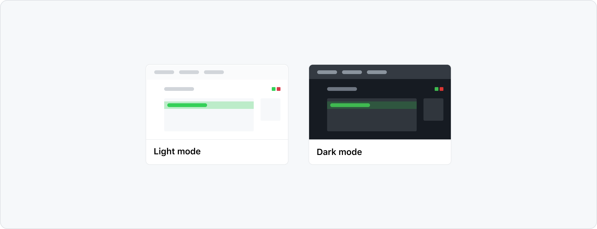
GitHub's UI offers a variety of different color modes. Every pattern in Primer is built to work across all color modes out of the box.
Color vision deficiency themes
Primer primitives include Protanopia & Deuteranopia and Tritanopia themes for dark and light mode. In these themes, green, red and orange are changed to different colors. This allows us to provide the right color contrast in the UI for people with Color Vision Deficiency - (CVD). For example, when comparing branches in pull requests.
When changing themes, we adjust the scales instead of changing the functional token references. This results in a mismatch of color scale names and the value they hold. For example, the green scale uses blue in CVD modes. This is not a bug but is desired for easier maintenance. Color scales should not be used directly, so this mismatch is not visible to our users.
Designing for themes
When designing product interfaces in Figma, we recommend using light mode. This is best because the Primer Figma components are only available in light mode. To preview your work in other modes, use the Figma color mode plugin.
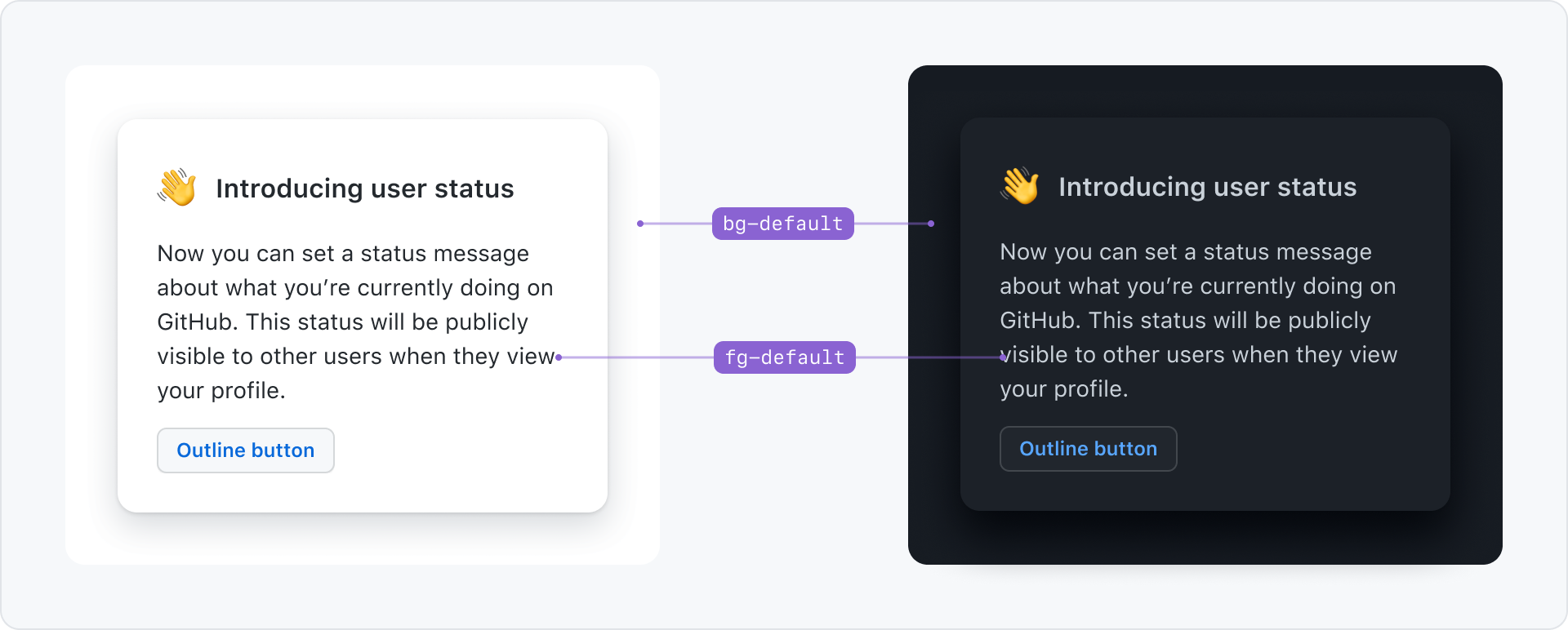
Support themes with design tokens
Primer delivers colors in the form of design tokens. Design tokens are a layer of abstraction that allows better maintainability, consistency and easy theming.
For example use bg-default for the background of the page and fg-default for the text color. If the user changes to dark mode, the underlying color that those tokens reference change, but the token names stay the same.