Functional colors
Introduction
The functional system is based on the meaning, or purpose, that colors have in the interface. Use functional design tokens in designs and code to build product interfaces.
By using Primer's functional color system you make sure that your interface:
- supports color modes out of the box
- gets all future themes updates "for free"
- uses accessible color combination across themes
Foundations
Foundational colors make up most of a product interface.
Foreground
Foundational foreground colors are used for base typeography, icons and component text.
Background
Foundational background colors apply to surfaces such as pages, boxes and tables.
Border
Foundational border colors are used to group content or to create a visible separation between sections or items.
Roles
Role colors highlight affordance or the meaning of elements in the UI.
Neutral
Accent
Used for interactive elements like links, buttons, form controls (checkboxes, radio buttons, etc.) and the "neutral" variant for banners.
Success
Used to highlight or emphasize a positive message, or indicate the primary action on a page.
Attention
Used to highlight or emphasize elements that require the user's attention.
Severe
Used to highlight or emphasize a level of severity between attention and danger.
Danger
Use to highlight or emphasize an error or a blocking status, where action is required.
Open
Used for "open" tasks or workflows.
Closed
Used for "closed" tasks or workflows.
Done
Used for "done" tasks or workflows.
Functional system in action
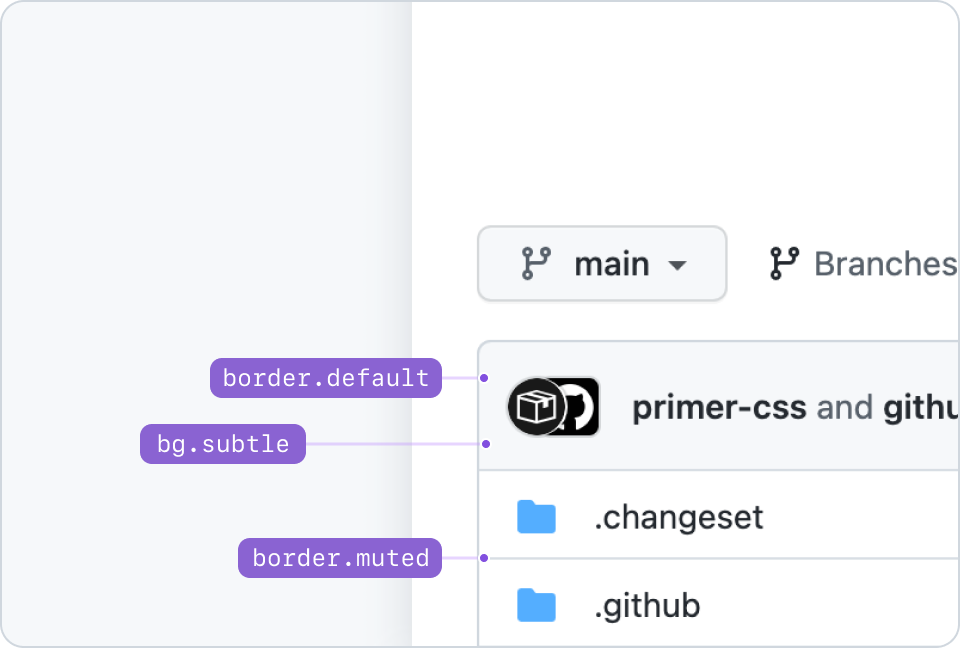
Example of pairing foundation tokens: bg.subtle with border.default, and border.muted.
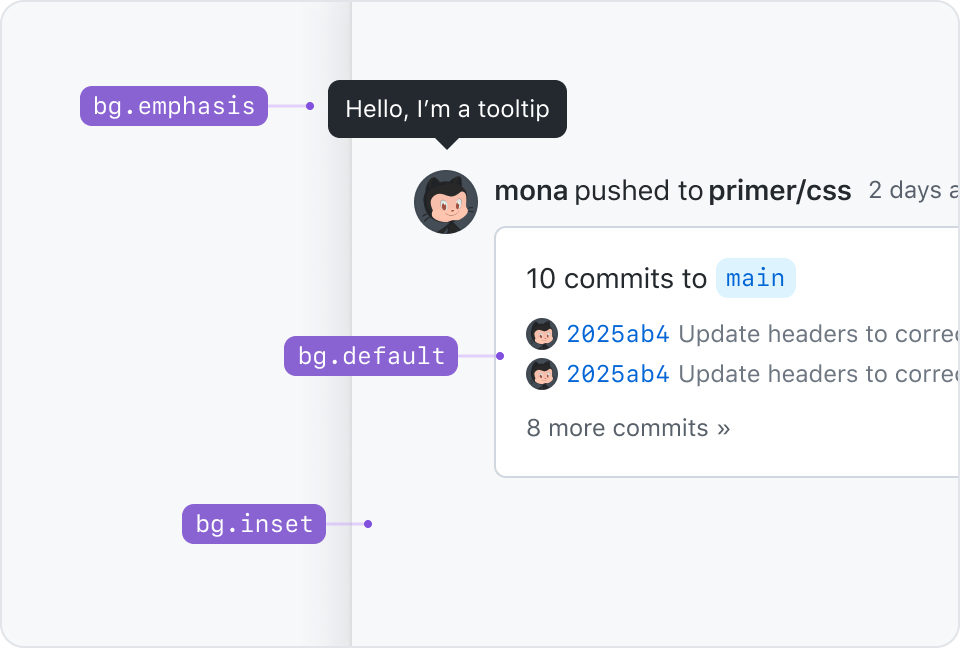
Thinking in terms of elevation, bg.inset would represent an underground level. It's meant to create a feeling of focus or depth.
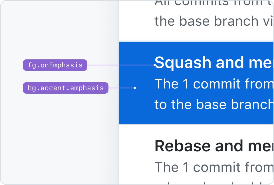
fg.onEmphasis pairs with bg.[ANY_COLOR_ROLE].emphasis tokens. This example shows fg.onEmphasis paired with bg.accent.emphasis.
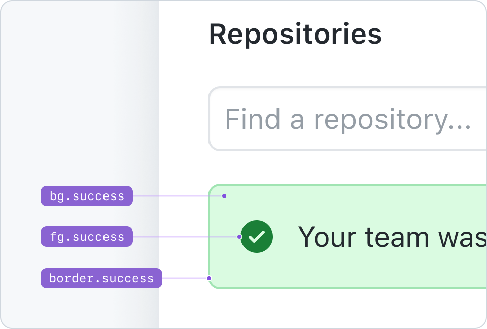
An example of an alert that pairs bg.success, fg.success, and border.success.
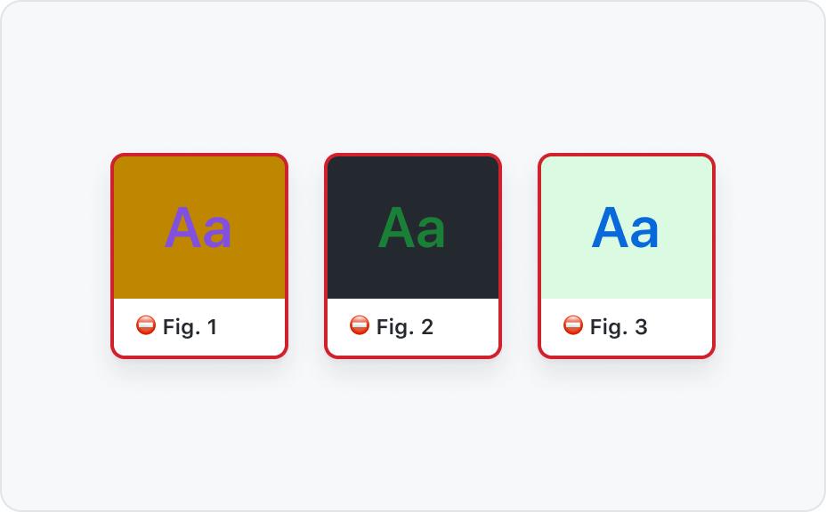
Combining colors
Not all colors pair well with each other. There are combinations of backgrounds and foregrounds that guarantee compliance with WCAG contrast guidelines and a wide range of hierarchical relationships between elements. Never use color on its own to convey a message or meaning. Pair it with explicit text and icons instead.
Pairing color roles
Pair color role foregrounds with their background counterparts or with bg.default and bg.subtle.
Never pair emphasis foregrounds with emphasis background.
Color roles and foregrounds
Only use fg.muted with bg.default, bg.subtle, and bg.inset.
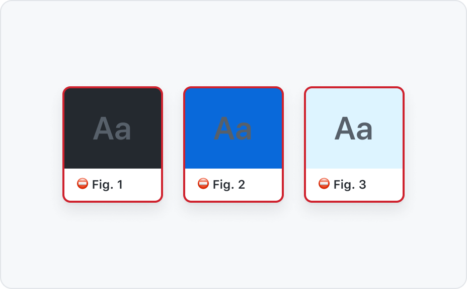
Never use fg.muted on bg.emphasis or any of the color roles backgrounds.
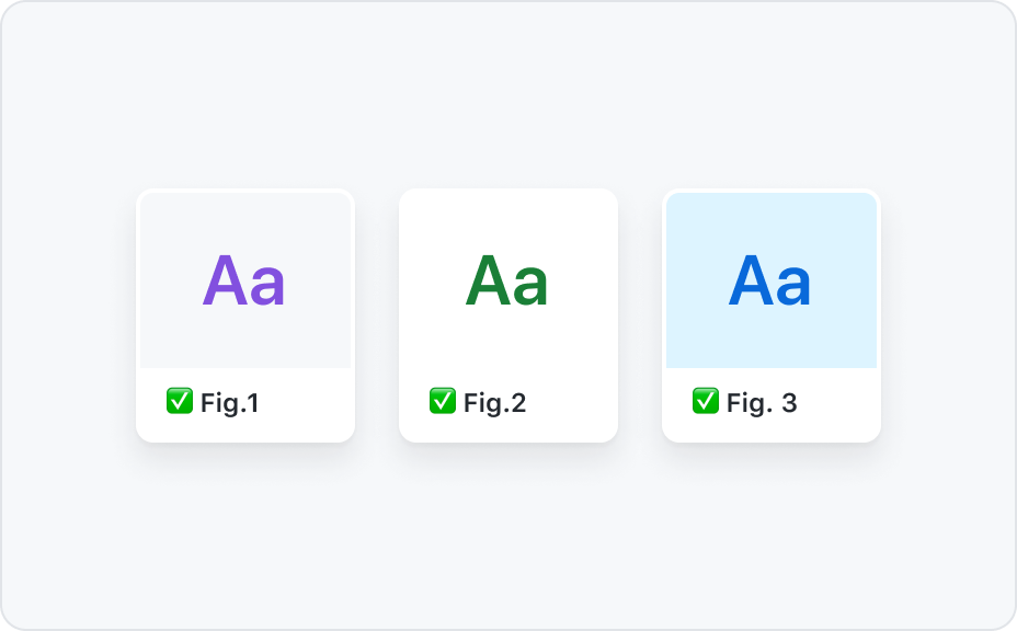
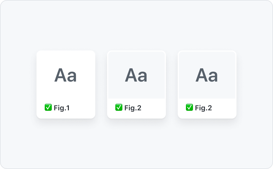
Color roles recipes
![Combination of design tokens 1: bg.[COLOR-ROLE] + border.[COLOR-ROLE] + fg.[COLOR-ROLE]](https://user-images.githubusercontent.com/378023/156498633-d6e47cb1-64b4-46fb-90d6-65a5c4c6a2bc.png)
![Combination of design tokens 2: bg.[COLOR-ROLE] + border.[COLOR-ROLE].emphasis + fg.[COLOR-ROLE]](https://user-images.githubusercontent.com/378023/156498642-f86a24b7-53ea-4b1e-ab47-0529587b08ef.png)
![Combination of design tokens 3: bg.default + border.[COLOR-ROLE].emphasis + fg.[COLOR-ROLE]](https://user-images.githubusercontent.com/378023/156498649-e81a19bf-c94e-436e-9efc-258a1fd3be57.png)
![Combination of design tokens 4: bg.[COLOR-ROLE] + border.[COLOR-ROLE] + fg.default](https://user-images.githubusercontent.com/378023/156498652-b1121c86-a670-4a92-9a8d-9db3c7e0ed9a.png)
How to use colors in Primer libraries?
Primer colors exist in different formats and are made available throughout the Primer libraries and tools. Not all colors exist everywhere and the naming depends on the Primer library. Below a list to help find the right Primer color documentation that is specific to that role and environment.
| I am | Documentation | Example color usage |
|---|---|---|
| A product designer working in Figma | Primer Primitives | bg/accent |
| An engineer using Primer ViewComponents | color system arguments | bg: :accent |
| An engineer using Primer React | sx props | accent.subtle |
| An engineer creating custom UI | Primer CSS color utilities | color-bg-accent |
| A Primer React maintainer creating a component | Primer Primitives js properties | accent.subtle |
| A Primer CSS maintainer creating a component | Primer Primitives css variables | --color-accent-subtle |
Stuck choosing the right color? Feel free to reach out in the #primer Slack channel.